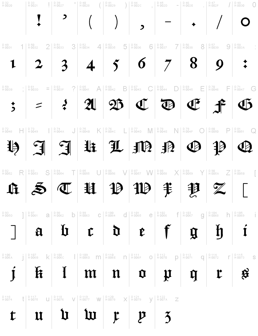
Textura Belgica
TrueTypeFreeware
TexturaBelgica.ttf
Mots clés
Note de l'auteur
Textura Belgica, the stunning gothic font designed by Jozef Herrebrugh, is the epitome of medieval style. Its intricate lines and sharp edges make it perfect for projects that require a touch of old-world charm. Whether you're designing a poster for a Renaissance fair or creating invitations for a medieval-themed wedding, Textura Belgica's semi-bold font and narrow width will add sophistication and elegance to your work. This typeface is also ideal for logos and branding materials that need to convey a sense of history and authenticity. Give your designs an air of timeless beauty with Textura Belgica.
The terror of many a student of Dutch Language and Culture! Textura Belgica is a true to tradition digitalisation of the blackletter type as it was used from the 16th into the 20th century in the Dutch language area.
With 'true to tradition' is meant that, in this font, differently from many other blackletter fonts you can find online, there is full support for the special characters you need to make your personal facsimiles!
This font had been digitalised using a high-resolution scan of a sheet with all letters, as made by type cutter and founder Hendrick van den Keere, from Gent in the 16th century. Beside this sheet, which I used as a base, I used:
- scans of the Dutch 'States Translation' of the Bible from 1637 (https://www.bijbelsdigitaal.nl/view/?bible=sv1637);
- via Google Books 'Verbael van 't Verhandelde over de Gravamina, Kerckelijke swaricheden tot Rotterdam, Oudewater, etc.' (https://books.google.nl/books?id=zRZjAAAAcAAJ&printsec=frontcover&);
- my own little private collection (two Bibles, early 19th and end 18th century, and a catechism, second half 18th century).
I have called this font 'Textura Belgica' as the term 'Belgica' during the 'golden age' of this type of font was used as the Latin name of all the Netherlands (equivalent in area with the modern Benelux). For example, the Latin name of the Dutch colony New Netherland was 'Nova Belgica'.
Table de caractères
Veuillez utiliser le menu déroulant pour visualiser de différents tableaux de caractères contenus dans cette police.

Informations sur les polices standards
Famille de police
Textura Belgica
Sous-famille de police
Regular
Nom complet de police
Textura Belgica
Version tableau de noms
Version
Nom de police postscript
TexturaBelgica
Informations sur les polices étendues
Plateformes supportées
PlateformeCodage
UnicodeUnicode 2.0 et sémantique en cours, unicode BMP uniquement
MacintoshRomain
MicrosoftUnicode BMP uniquement
Détails de la police
Créé2021-10-26
Révision1
Comptage des glyphes110
Unités par Em4096
Droits incorporationIncorporation pour installation permanente
Classe famillePas de classification
PoidsMoyen (normal)
LargeurMoyen (normal)
Mac styleGras
DirectionSeulement glyphes fortement gauche-à-droit + glyphes neutres
Caractéristiques des modèlesOrdinaire
EspacementNon fixe