Read
OpenTypeUsage privé
- Accents (partiel)
- Euro
Read.otf
Mots clés
Note de l'auteur
Read, designed by Scratchones, is a semi-bold font that channels the authenticity and charm of handwritten text. With its fluid curves and slightly varied line weights, this typeface exudes a casual elegance that is both approachable and distinctive. The Read font's aesthetic appeal lies in its organic structure, which makes it ideal for designs that require a personal touch.
The semi-bold weight of Read ensures that it stands out on both digital screens and printed materials without overwhelming the reader. Its handwritten style offers a refreshing break from the rigidity of traditional typesetting, making it perfect for projects aiming to convey warmth and individuality.
Whether employed in branding, invitation cards, or editorial layouts, Read brings an element of bespoke craftsmanship to any project. Its versatility extends to web design as well; where its engaging character can greatly enhance user experience by adding an intimate feel to digital interactions.
Embrace the stylistic flair of Read for your next creative venture and let your words make an impression that lasts.
Links for license and contact:
================================================== =========
https://scratchones.com
gmail : afistakosongtujuh@gmail.com
================================================== =========
ATTENTION:
WARNING!!!
By installing or using this font, you agree to the Product Use Agreement:
- This font has a FULL VERSION and is ONLY for PERSONAL USE. NO COMMERCIAL USE!
- If you need CUSTOM PERMIT or COMPANY PERMIT please go to : ( www.scratchones.com )
- Any donations are greatly appreciated. Paypal account for donations:
( www.paypal.me/scratchones )
USE OF COMMERCIAL FONT WITHOUT PURCHASE OF LICENSE
OFFICIAL www.scratchones.com will be fined 8X THE MINIMUM LICENSE FEES FROM THE LICENSE PRICE !!!!
Thanks
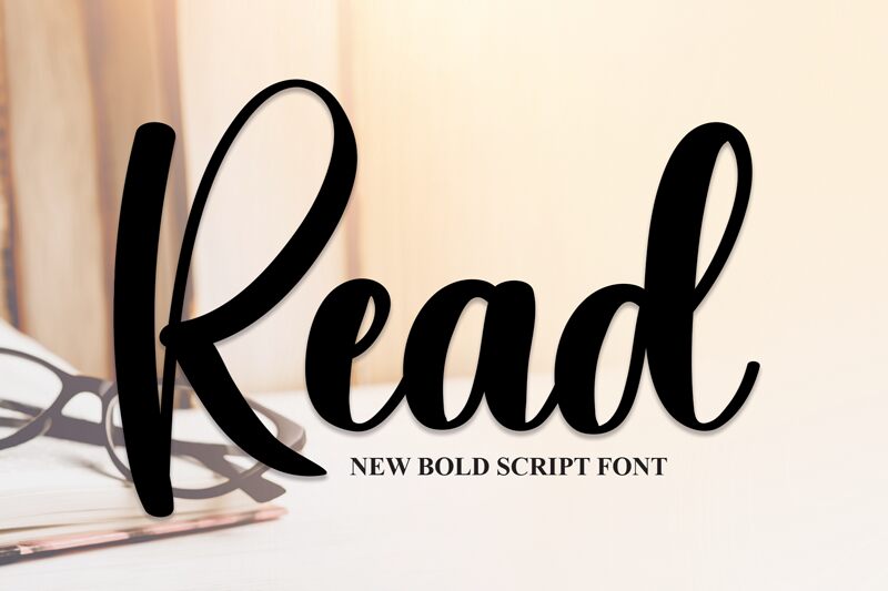
Table de caractères
Veuillez utiliser le menu déroulant pour visualiser de différents tableaux de caractères contenus dans cette police.

Informations sur les polices standards
Famille de police
Read
Sous-famille de police
Regular
Identification unique de sous-famille
1.001;ReadRegular
Nom complet de police
Read
Version tableau de noms
Version 1.001;Fontself Maker 3.5.8
Nom de police postscript
ReadRegular
Famille favorite
Read
Sous-famille favorite
Regular
Informations sur les polices étendues
Plateformes supportées
PlateformeCodage
MicrosoftUnicode BMP uniquement
Détails de la police
Créé2022-11-24
Révision1
Comptage des glyphes174
Unités par Em1000
Droits incorporationIncorporation pour installation permanente
Classe familleÉcrit
PoidsMoyen gras
LargeurMoyen (normal)
Mac styleGras
DirectionSeulement glyphes fortement gauche-à-droit + glyphes neutres
Caractéristiques des modèlesOrdinaire