Lightsaber DEMO
TrueTypeDémo
Lightsaber DEMO.ttf
Mots clés
Note de l'auteur
Purchase the Full Font: https://sellfy.com/p/IatR/
With Standard License and more freebies!
Check the Animated Preview first!
Preview 1: http://image.ibb.co/fAWz8S/Lightsaber_Font_Cover_1_NEON.gif
Preview 2: http://image.ibb.co/hZq6Nn/Lightsaber_Font_Cover_2_NEON.gif
Preview 3: http://image.ibb.co/mnVUa7/Lightsaber_Font_Cover_3_NEON.gif
Preview 4: http://image.ibb.co/eFXxTS/Lightsaber_Font_Cover_4_NEON.gif
Preview 5: http://image.ibb.co/gAV6Nn/Lightsaber_Font_Cover_5_NEON.gif
When you think everything is stagnant, here comes Lightsaber Font! It's like an all capital script written at the back pages of a college student's notebook (in a boring class). Lightsaber bears a new approach on handlettering style with equally slanted monolines. Those "i" and "o" glyph will give your thumbnail a fierce look while preserving the essence of your photographs. Plus, put an animated text on the header of your blog with our Lightsaber Neon Animation!
Fonts:
Lightsaber - contains an all capital uppercase and lowercase. Combine both to achieve a natural look. It also contains some swashes and special glyphs found on this symbols: ( ) / [ ] _
Lightsoff Sans - paired to Lightsaber with all capital letters and has a great spacing. Lightsoff Sans works fine on most design presentations.
Tip: You can combine Lightsaber's first letter along with Lightsoff Sans' glyphs for a formal-looking signature.
Actions:
Lightsaber Neonize
Put neon effect on everything! Neonize your text even with gradient effect. Neonize your logo! Neonize anything!
Lightsaber Animate
This is the future of neon effect. With this invention, you can make your neon designs go electrocuted!
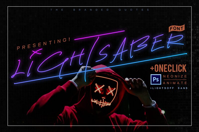
Table de caractères
Veuillez utiliser le menu déroulant pour visualiser de différents tableaux de caractères contenus dans cette police.

Informations sur les polices standards
Famille de police
Lightsaber DEMO
Sous-famille de police
Regular
Identification unique de sous-famille
Lightsaber:Version 1.00
Nom complet de police
Lightsaber DEMO
Nom de police postscript
Lightsaber
Informations sur les polices étendues
Plateformes supportées
PlateformeCodage
MicrosoftUnicode BMP uniquement
MacintoshRomain
UnicodeUnicode 2.0 et sémantique en cours, unicode BMP uniquement
Détails de la police
Créé2018-02-15
Révision1
Comptage des glyphes94
Unités par Em2048
Droits incorporationIncorporation pour installation permanente
Classe familleÉcrit
PoidsTrès gras
LargeurSemi-élargie
Mac styleGras
DirectionSeulement glyphes fortement gauche-à droit
Caractéristiques des modèlesItalique
EspacementNon fixe