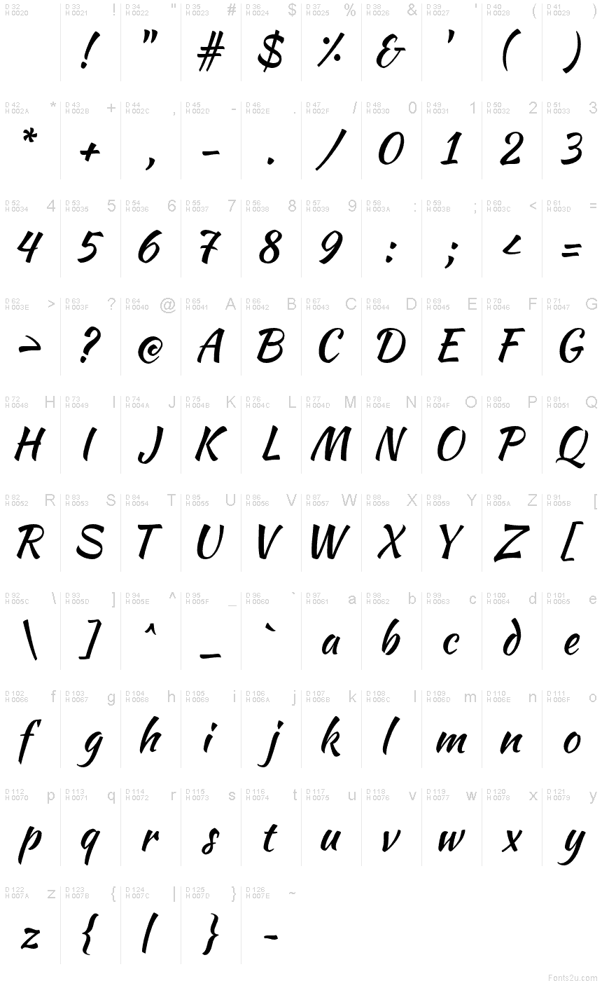
Kaushan Script
TrueTypeFreeware
- Accents (partiel)
- Accents (complet)
- Euro
KaushanScript-Regular.ttf
Mots clés
Table de caractères
Veuillez utiliser le menu déroulant pour visualiser de différents tableaux de caractères contenus dans cette police.

Informations sur les polices standards
Avis de droits d’auteur
Copyright (c) 2011, Pablo Impallari (www.impallari.com|impallari@gmail.com),
Copyright (c) 2011, Igino Marini. (www.ikern.com|mail@iginomarini.com),
with Reserved Font Name Kaushan Script.
Copyright (c) 2011, Igino Marini. (www.ikern.com|mail@iginomarini.com),
with Reserved Font Name Kaushan Script.
Famille de police
Kaushan Script
Sous-famille de police
Regular
Identification unique de sous-famille
PabloImpallari: Kaushan Script: 2011
Nom complet de police
Kaushan Script
Version tableau de noms
Version 1.002
Nom de police postscript
KaushanScript-Regular
Avis de marque déposée
Kaushan Script is a trademark of Pablo Impallari.
Nom du fabricant
Créateur
Description
Kaushan Script feels like writing quickly with an inked brush.
When making digital typefaces, the more you refine the shapes of the letters, the more energy you take away from them. Because of that, Kaushan is unrefined - and carries a lot of energy.
By avoiding typographical perfection, it stays more natural. The angles of the vertical strokes vary a little, and the positioning along the baseline jumps around, giving it a more rustic and natural feeling.
Most script fonts have long ascenders and descenders, and this means they look too small when used at normal sizes on the web. This font it's optimized in the technical details to be very readable as a web font, even when used as small as at 16 pixels.
It was funded by people like you, via Kickstarter.
Special thanks to the project backers! They are all listed on the website: http://www.impallari.com/kaushan
Informations sur les polices étendues
Plateformes supportées
PlateformeCodage
UnicodeUnicode 2.0 et sémantique en cours, unicode BMP uniquement
MacintoshRomain
MicrosoftUnicode BMP uniquement
Détails de la police
Créé2012-01-21
Révision1
Comptage des glyphes394
Unités par Em1000
Droits incorporationIncorporation pour installation permanente
Classe familleÉcrit
PoidsMoyen (normal)
LargeurMoyen (normal)
Mac styleGras
DirectionSeulement glyphes fortement gauche-à-droit + glyphes neutres
Caractéristiques des modèlesItalique
EspacementNon fixe