FaberSansPro-Fett
TrueTypeUsage privé
FaberSansPro95reduced.ttf
Mots clés
Note de l'auteur
Two fonts in one: a classic-modern sans serif appearing in two forms "standard" and a "stylistic alternate" with uncial script-orientated characters which give the font a completely different "look."
The idea for one of the very first ingoFonts, the sans serif "Faber Eins & Zwei," originated in 1996. This typeface gained popularity over the years, especially in Anglo-Saxon countries. A lot has changed since then not just in font technology. In 2010 it was time for a basic revision of this attractive font, and time to bring it up to date with current font technology.
A uniqueness of Faber Sans Pro is that it is actually composed of two fonts. The "basic typeface" is a sans serif in the classic-modern style of type creations of the early 20th century godfathered by Futura from Paul Renner and Gill Sans from Eric Gill. The Roman Capitalis provided the model for the classically proportioned capital letters and the harmonic shapes of the humanistic minuscule for the lower case characters. And so a font with pleasant rhythmic proportions was created and is extremely comfortable to read, especially in large amounts of text; but, it is also reader-friendly under adverse typographic conditions on the monitor.
A "second" typeface with its own personal character resulted as stylistic alternates were designed for the letters a e f g l t u in accordance with the uncial scripts of the late antiquity or rather the early Middle Ages. And the r is given a playful point in the stylistic alternates. Modern OpenType technology makes it possible to combine the previously separate typefaces into one font. The stylistic alternate can be accessed via the OpenType-Functions Discretionary Ligatures or also Stylistic Alternates (and of course the glyph panel).
Unlike classic sans serifs, Faber Sans Pro includes a "true" italic. The italic characters are not simply just slanted variations of the upright, but the characters originated out of handwriting styles; they are rounder and the stroke flow is more fluent than on the upright letters. Some italic letters truly have their very own design which clearly comes from handwriting, particularly noticeable on a and g.
At ingoFonts all fonts can be downloaded. Gratis. Free.
Here's the catch: The files offered here to download contain only a reduced font. That means, the font only consists of uppercase and lowercase from A to Z or rather, a to z.
The complete font including numerals, umlauts, punctuation and especially ligatures is only available with your order and your cash.
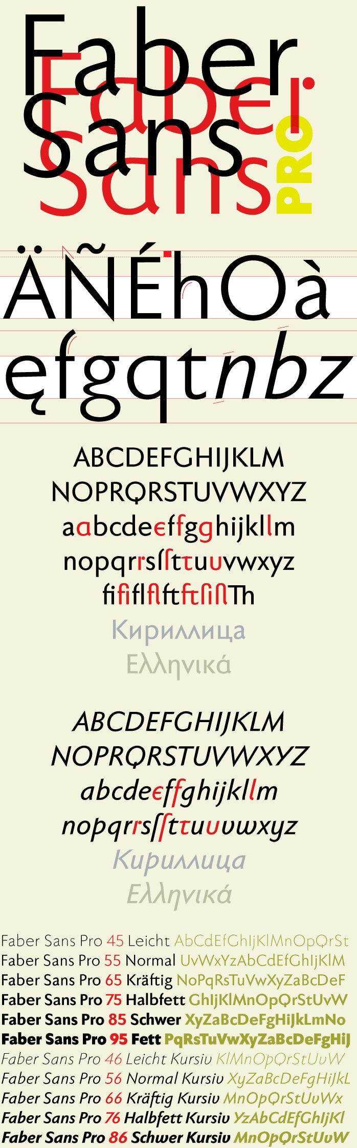
Table de caractères
Veuillez utiliser le menu déroulant pour visualiser de différents tableaux de caractères contenus dans cette police.

Informations sur les polices standards
Avis de droits d’auteur
Copyright (c) 2010 by Ingo Zimmermann ingoFont Augsburg. All rights reserved.
Famille de police
Faber Sans Pro reduced
Sous-famille de police
95 Fett
Identification unique de sous-famille
IngoZimmermanningoFontAugsburg: Faber Sans Pro 95 Fett: 2010
Nom complet de police
FaberSansPro-Fett
Version tableau de noms
Version 4.013
Nom de police postscript
FaberSansPro-Fett
Avis de marque déposée
Faber Sans Pro 95 Fett is a trademark of Ingo Zimmermann ingoFont Augsburg.
Nom du fabricant
Créateur
Description
Copyright (c) 2010 by Ingo Zimmermann ingoFont Augsburg. Reviewed. All rights reserved.
Informations sur les polices étendues
Plateformes supportées
PlateformeCodage
UnicodeUnicode 2.0 et sémantique en cours, unicode BMP uniquement
MacintoshRomain
MicrosoftUnicode BMP uniquement
Détails de la police
Créé2010-10-24
Révision4
Comptage des glyphes53
Unités par Em1000
Droits incorporationIncorporation pour installation permanente
Classe familleSans sérif
PoidsGras
LargeurMoyen (normal)
Mac styleItalique
DirectionSeulement glyphes fortement gauche-à-droit + glyphes neutres
Caractéristiques des modèlesOrdinaire
EspacementNon fixe
Pack complet contient des poids de police 10 ci-dessous:
FaberSansPro95reduced.ttf
FaberSansPro65reduced.ttf
FaberSansPro76reduced.ttf
FaberSansPro66reduced.ttf
FaberSansPro55reduced.ttf
FaberSansPro45reduced.ttf
FaberSansPro86reduced.ttf
FaberSansPro56reduced.ttf
FaberSansPro75reduced.ttf
FaberSansPro85reduced.ttf
FaberSansPro65reduced.ttf
FaberSansPro76reduced.ttf
FaberSansPro66reduced.ttf
FaberSansPro55reduced.ttf
FaberSansPro45reduced.ttf
FaberSansPro86reduced.ttf
FaberSansPro56reduced.ttf
FaberSansPro75reduced.ttf
FaberSansPro85reduced.ttf
FaberSansPro-Kraeftig
TrueTypeUsage privé
FaberSansPro-HalbfettKursiv
TrueTypeUsage privé
FaberSansPro-KraeftigKursiv
TrueTypeUsage privé
FaberSansPro-Normal
TrueTypeUsage privé
FaberSansPro-Leicht
TrueTypeUsage privé
FaberSansPro-SchwerKursiv
TrueTypeUsage privé
FaberSansPro-NormalKursiv
TrueTypeUsage privé
FaberSansPro-Halbfett
TrueTypeUsage privé
FaberSansPro-Schwer
TrueTypeUsage privé