Domine
TrueTypeFreeware
- Accents (partiel)
- Accents (complet)
- Euro
Domine-Regular.ttf
Mots clés
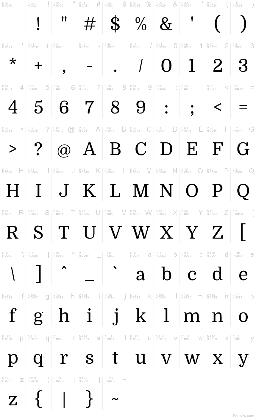
Table de caractères
Veuillez utiliser le menu déroulant pour visualiser de différents tableaux de caractères contenus dans cette police.

Informations sur les polices standards
Avis de droits d’auteur
Copyright (c) 2012, Pablo Impallari (www.impallari.com|impallari@gmail.com),
Copyright (c) 2012, Rodrigo Fuenzalida (www.rfuenzalida.com|hello@rfuenzalida.com),
Copyright (c) 2012, Brenda Gallo (gbrenda1987@gmail.com), with Reserved Font Name Domine.
Copyright (c) 2012, Rodrigo Fuenzalida (www.rfuenzalida.com|hello@rfuenzalida.com),
Copyright (c) 2012, Brenda Gallo (gbrenda1987@gmail.com), with Reserved Font Name Domine.
Famille de police
Domine
Sous-famille de police
Regular
Identification unique de sous-famille
PabloImpallari,RodrigoFuenzalida,BrendaGallo: Domine: 2012
Nom complet de police
Domine
Version tableau de noms
Version 1.000; ttfautohint (v0.93) -l 8 -r 50 -G 200 -x 14 -w "G"
Nom de police postscript
Domine-Regular
Avis de marque déposée
Domine is a trademark of Pablo Impallari
Nom du fabricant
Créateur
Description
From the very first steps in the design process 'Domine' was designed, tested and optimized for body text on the web.
It shines at 14 and 16 px. And can even be used as small as 11, 12 or 13px.
Harmless to the eyes when reading long texts.
Domine is a perfect choice for newspapers or magazines websites, where text is the main focus.
It's is friendly in appearance because it combines the classic elements of familiar typefaces that have been in use from more than 100 years like Clarendon, Century, Cheltenham and Clearface.
- The rounded letters (b, c, d, e, o, p, q) are a bit squarish on the inside. This feature opens up the counters for better rendering and also make it look a bit more up-to-date than the classic typefaces previously referenced.
- The serifs are a bit shorter than usual. Another feature that improves the rendering by allowing more "air" between each letter pair.
- The joins of the stems to the branches in letters like h, m, n are deep enough to prevent dark spots, also improving legibility at small sizes.
- The friendly lowercase 'a', with the curve starting from the bottom of the stem, is reminiscent of Cheltenham and Clearface. That soft curve is also echoed in the curves of the f, j, n, m and r.
- The spacing is also optimized for body text on the web, clearly more open than that of typefaces made for print or for headlines.
Informations sur les polices étendues
Plateformes supportées
PlateformeCodage
UnicodeUnicode 2.0 et sémantique en cours, unicode BMP uniquement
MacintoshRomain
MicrosoftUnicode BMP uniquement
Détails de la police
Créé2012-11-28
Révision1
Comptage des glyphes437
Unités par Em1000
Droits incorporationIncorporation pour installation permanente
Classe familleSérifs forme libre
PoidsMoyen (normal)
LargeurMoyen (normal)
Mac styleGras
DirectionSeulement glyphes fortement gauche-à-droit + glyphes neutres
Caractéristiques des modèlesOrdinaire
EspacementNon fixe
Pack complet contient des poids de police 2 ci-dessous:
Domine-Regular.ttf
Domine-Bold.ttf
Domine-Bold.ttf
Domine Bold
TrueTypeFreeware