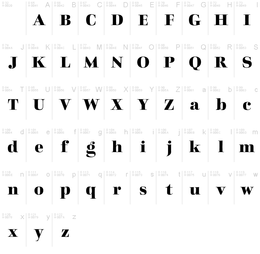
Charpentier Classicistique Reduced Bold
TrueTypeUsage privé
CharpentierClassicRed_Bd.ttf
Mots clés
Note de l'auteur
Charpentier Classicistique Reduced font is an unconventional classicistic Roman typeface designed by Ingo Zimmermann of ingoFonts.
This Roman typeface has a livelier effect than is typical of the epoch of classicistic style.
In the lower case letters, an echo of the smoother forms of historically early scripts is identifiable. Typical of a classicistic Roman typeface are the emphasized and clear contrast in the weight of the strokes, the fine serifs and the accentuation of the vertical bold stem. Charpentier Classicistique is pleasantly legible. Its effect is much less harsh than other classicistic fonts. The pointed forms of M and N are uncommon.
At 30, the italic version of Charpentier Classicistique is unusually strongly slanted. The italic lower case letters refer, in part, to English handwriting, which also falls under classicism. Especially the curves show forms influenced by writing.
Charpentier Classicistique is available in four font weights:
regular, semibold, bold and black.
Thanks to OpenType and Unicode, Charpentier Classicistique Standard and Charpentier Classicistique Pro support all European languages including Turkish, Greek and Russian. Both versions include lots of ligatures, also discretional ones, as well as figures for normal setting and tabular figures with constant width and cap-height figures.
The font downloadable here is a reduced version (without punctuation, ligatures, numbers etc.). A commercial version of this font (with all features) is available at www.ingofonts.com.
Table de caractères
Veuillez utiliser le menu déroulant pour visualiser de différents tableaux de caractères contenus dans cette police.

Informations sur les polices standards
Avis de droits d’auteur
Copyright (c) 2014 by Ingo Zimmermann ingoFonts Augsburg. All rights reserved.
Famille de police
Charpentier Classicistique Reduced
Sous-famille de police
Bold
Identification unique de sous-famille
IngoZimmermanningoFontsAugsburg: Charpentier Classicistique Reduced Bold: 2014
Nom complet de police
Charpentier Classicistique Reduced Bold
Version tableau de noms
Version 1.009
Nom de police postscript
CharpentierClassicistiqueRed
Avis de marque déposée
Charpentier Classicistique Reduced Bold is a trademark of Ingo Zimmermann ingoFonts Augsburg.
Nom du fabricant
Créateur
Description
Copyright (c) 2014 by Ingo Zimmermann ingoFonts Augsburg. All rights reserved.
Informations sur les polices étendues
Plateformes supportées
PlateformeCodage
UnicodeUnicode 2.0 et sémantique en cours, unicode BMP uniquement
MacintoshRomain
MicrosoftUnicode BMP uniquement
Détails de la police
Créé2015-04-03
Révision1
Comptage des glyphes53
Unités par Em1000
Droits incorporationIncorporation pour édition permise
Classe familleSérifs forme libre
PoidsGras
LargeurMoyen (normal)
Mac styleItalique
DirectionSeulement glyphes fortement gauche-à-droit + glyphes neutres
Caractéristiques des modèlesGras
EspacementNon fixe
Pack complet contient des poids de police 7 ci-dessous:
CharpentierClassicRed_Bd.ttf
CharpentierClassicRed_It.ttf
CharpentierClassicRed_MdIt.ttf
CharpentierClassicRed_Med.ttf
CharpentierClassicRed_Reg.ttf
CharpentierClassicRed_Blk.ttf
CharpentierClassicRed_BdIt.ttf
CharpentierClassicRed_It.ttf
CharpentierClassicRed_MdIt.ttf
CharpentierClassicRed_Med.ttf
CharpentierClassicRed_Reg.ttf
CharpentierClassicRed_Blk.ttf
CharpentierClassicRed_BdIt.ttf
Charpentier Classicistique Reduced Italic
TrueTypeUsage privé
Charpentier Classicistique Reduced Semibold Italic
TrueTypeUsage privé
Charpentier Classicistique Reduced Semibold
TrueTypeUsage privé
Charpentier Classicistique Reduced
TrueTypeUsage privé
Charpentier Classicistique Reduced Black
TrueTypeUsage privé
Charpentier Classicistique Reduced Bold Italic
TrueTypeUsage privé
