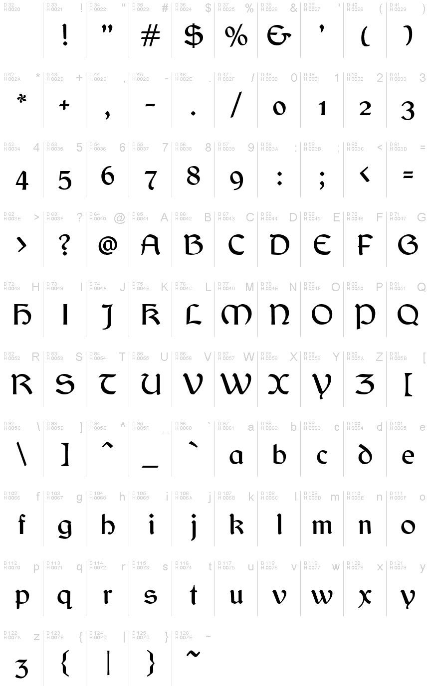
Balgruf
OpenTypeGNU/GPL
- Accents (partiel)
- Accents (complet)
- Euro
Balgruf.otf
Mots clés
Note de l'auteur
Looking for a font that will add a touch of medieval mystery to your project? Look no further than Balgruf, designed by the masterful Paul Miller. With its gothic typeface and celtic style, this semi-bold font is perfect for adding an air of intrigue to any design. Whether you're creating a logo for a fantasy-themed business or designing invitations for a Renaissance fair, Balgruf will help your text stand out in a truly unique way. So why settle for boring standard fonts when you can embrace the dark beauty of Balgruf?
This is a font inspired by the game 'Skyrim', if you have ever played Skyrim and read any of the books there you may have noticed that the upper case 'F' looks out of place and has a very large right side bearing. It looks like a graphic designer with no typographical experience was given the job of making an F on a very tight deadline and this is what he/she came up with. It seems to be cobbled together from pieces of other characters in the font cut up and glued together.
Once you see this mistake you cannot unsee it. As a type designer I thought I could have done better. So the question arose, how would I have done it. This font is the answer to that question.
Enjoy!
Table de caractères
Veuillez utiliser le menu déroulant pour visualiser de différents tableaux de caractères contenus dans cette police.

Informations sur les polices standards
Avis de droits d’auteur
Copyright (c) Paul James Miller, 2020. All rights reserved.
Famille de police
Balgruf
Sous-famille de police
Regular
Identification unique de sous-famille
Balgruf:Version 1.201
Nom complet de police
Balgruf
Version tableau de noms
Version 1.201;March 28, 2021;FontCreator 13.0.0.2683 64-bit
Nom de police postscript
Balgruf
Nom du fabricant
Créateur
Description
As a typographer playing Skyrim by Bethesda I was annoyed by the font used in the books. The upper case 'F' seemed to have been cobbled together from other bits of the font and didn't fit with the aesthetic of the rest of the letters in the font, it also had a right side bearing which was much too large.
As if it had been hastily made by a graphic designer with no experience in typography who was on a strict deadline.
Once you 'see' this mistake you cannot unsee it and it was annoying.
So the question arose, how would I have done it?
This font is the answer to that question.
Enjoy !
As if it had been hastily made by a graphic designer with no experience in typography who was on a strict deadline.
Once you 'see' this mistake you cannot unsee it and it was annoying.
So the question arose, how would I have done it?
This font is the answer to that question.
Enjoy !
Informations sur les polices étendues
Plateformes supportées
PlateformeCodage
UnicodeUnicode 2.0 et sémantique en cours, unicode BMP uniquement
MacintoshRomain
MicrosoftUnicode BMP uniquement
Détails de la police
Créé2020-10-23
Révision1
Comptage des glyphes453
Unités par Em2048
Droits incorporationIncorporation pour installation permanente
Classe famillePas de classification
PoidsMoyen (normal)
LargeurMoyen (normal)
Mac styleGras
DirectionSeulement glyphes fortement gauche-à-droit + glyphes neutres
Caractéristiques des modèlesOrdinaire
EspacementNon fixe
Pack complet contient des poids de police 2 ci-dessous:
Balgruf.otf
Balgruf_Italic.otf
Balgruf_Italic.otf
Balgruf Italic
OpenTypeGNU/GPL