Polices similaires

Note de l'auteur

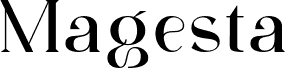
Amarfil is a free high-contrast serif font with a stately, fashion-minded profile. Its tall capitals pair hairline strokes with broad verticals and crisp, blade-like serifs. The curves are generous and controlled.

Its Didone character makes it well suited to fashion magazines and luxury packaging, where the sharp contrast lends an elegant editorial air. The formal sweep suits brands aimed at a classic, upscale market. It also fits book covers and cultural event posters with a refined, theatrical edge.

--

Some characters of this typeface were initially auto-traced. The paths were smoothed, and the remaining characters were later cleaned as well. The typeface is named after the mother of someone close to the creator.

It was traced from the Dubbelde Auguftyn Capitalen typeface by father and son Izakk and Johan Ensched, who owned a press shop in Amsterdam in the 16th century. All characters were traced as they appeared in the original print. The font contains uppercase letters only; it has no lowercase letters, numbers, or punctuation.

This font is free for non-commercial use and is donationware for commercial use. Donations can be made through PayPal using the following account:

turoturom@yahoo.es

Étiquettes

Table des caractères

Utilisez le menu déroulant pour afficher les différentes tables de caractères incluses dans cette police.
Latin de base - Table des caractères

Informations de base sur la police

Avis de droits d’auteur
This font is free for non-commercial use and donationware for commercial use. Make a donation through PayPal my account there is: turoturom@yahoo.es
Famille de police
Amarfil
Sous-famille de police
Regular
Identification unique de sous-famille
1.000;pyrs;Amarfil
Nom complet de police
Amarfil
Version tableau de noms
Version 1.00 2012
Nom de police postscript
Amarfil
Créateur
MARIO ARTURO
Description
This font is inspired by the Dubbelde Auguftyn Capitalen typeface by father and son Izakk and Johan Enschedé. They owned a press shop in Amsterdam back in the 16th century. . I traced all characters and even them out (sizes, serifs). This is all there is, there are no lowercases, number nor punctuations. Please, address complaints to Izakk and Johan Enschedéu by Ouija board.

Informations détaillées sur la police

Plateformes prises en charge

PlateformeEncodage
UnicodeUnicode 2.0 et sémantique en cours, unicode BMP uniquement
MacintoshRomain
MicrosoftUnicode BMP uniquement

Détails de la police

Créée2012-07-25
Révision1
Nombre de glyphes37
Unités par em1000
Droits d'incorporationIncorporation pour impression et prévisualisation permise
Classe de familleSérifs de transition
GraisseMoyen gras
LargeurSemi-élargie
Style MacGras
DirectionSeulement glyphes fortement gauche-à-droit + glyphes neutres
Nature du motifOrdinaire
ChasseNon fixe