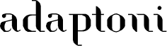
Adaptoni, designed by Rui Batista of FSI FontShop International GmbH, is a free high-contrast serif with broad, sculpted curves and razor-thin joins. Its broken strokes give the letters a crisp, cut-paper quality.
Packaging can use that mix of elegance and interruption to suggest a fashion-led or experimental product. The same sharply edited forms suit magazine covers, cultural posters, and music artwork. Their stencil-like gaps are especially apt for projects built around collage, modernist graphics, or fragmented imagery.