XylitolFront-Regular
OpenTypeFreewareMises à jour
- Accents (partiel)
- Accents (complet)
- Euro
Xylitol Front.otf
Mots clés
Note de l'auteur
Xylitol is a multiple layer typeface you can use for creating chromatic, 3D effects. Its designed so the letters fit tightly together like Tetris blocks. There are four directional layers for the sides so you can simulate light coming from various directions. Theres a stripe layer which can be used to created a metallic shimmer effect. The Hollow style is made of thin outlines and has multiple uses. Use it on its own for a engineery, blueprint look. Make it black and overlay it on solid colors for a stained glass effect. Set it to 50% gray and use a screen or color dodge effect at around 25% opacity to create a subtle sharpening effect. The solid layer can be offset to simulate a drop shadow. The Xylitol family includes a Solo style which has more conventional spacinghandy when you need accompanying flat text. An outline style is useful on its own of for doing layer transparency tricks. Xylitol supports lot of languages including Greek and Russian.
Its all about experimenting but here are some tips to get you started:
Youll need to use an application that allows you to overlay layers of text. Every application has a different way of dealing with this but generally, you type what you want, make several overlapping copies of the layer then alter each layers color and style.
Some applications, like Photoshop ignore the fonts vertical metrics so you may need to vertically shift some of the layers to align. The diamond (lozenge) ◊ character contains a registration cross-hair to help you get things lined up.
Make sure youre not using optical kerning in Adobe apps.
If youre using the front layer and all the edge layers, you might think its unnecessary to include the back layer. But the back layer can help obscure some of the background leaking through due to layer rendering imprecision. You might not need it but its there if you do.
If you plan on including the Hollow style, I recommend using it as the first layer and checking carefully for unwanted overlaps before copying the layer. For example, the T may overlap A a tiny bit. Thats the way the typeface is designedthe priority is to have the edges set tight. You can fix the overlaps by adjusting tracking. Its no fun if you add Hollow as the final layer, notice an overlap and realize that the tracking will have to be adjusted for each layer.
The desktop license for all styles of Xylitol is free. If you'd like to embed any of these fonts in an app, ebook, on the web or anything that's not covered by the desktop license agreement, visit the link below. You'll find distributors who offer different types of licenses or you can contact me for help.
Please read the FAQ on the front page of Typodermic Fonts and don't be afraid to ask questions if you're not sure.
http://typodermicfonts.com/xylitol
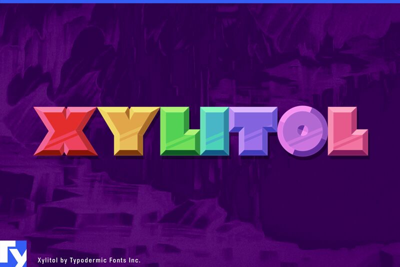
Table de caractères
Veuillez utiliser le menu déroulant pour visualiser de différents tableaux de caractères contenus dans cette police.

Informations sur les polices standards
Avis de droits d’auteur
Released in 2024 under CC0 license. No rights reserved.
Famille de police
Xylitol Front
Sous-famille de police
Regular
Identification unique de sous-famille
Version 1.001;TYPO;XylitolFront-Regular;2024;FL830
Nom complet de police
XylitolFront-Regular
Version tableau de noms
Version 1.001
Nom de police postscript
XylitolFront-Regular
Nom du fabricant
Ray Larabie
Créateur
Description
The 1970s were all about experimentation, and Xylitol is the typeface that perfectly embodies that spirit. It’s a geometric wonder that will take your designs to the next level with its unusual layer system. Imagine creating chromatic, 3D effects that pop off the page like a retro sci-fi movie. Xylitol has got you covered.
The typeface is designed to fit together tightly, like Tetris blocks, with four directional layers for simulating light from various angles. And if you want to add a metallic shimmer effect, the stripe layer is perfect for achieving that look.
But that’s not all. The Hollow style is a game-changer. Its thin outlines create a blueprint look that’s engineered to perfection. But you can also use it to create a stained-glass effect by overlaying it on solid colors. And if you want to sharpen your design, set it to 50% gray and use a screen or color dodge effect at around 25% opacity.
And let’s not forget the solid layer, which can be offset to simulate a drop shadow. But if you’re looking for a more conventional look, Xylitol’s Solo style has got you covered. Its conventional spacing is perfect for accompanying flat text. And if you want to get creative, the outline style is perfect for layer transparency tricks.
Of course, experimenting with Xylitol takes a little know-how. You’ll need to use an application that allows you to overlay layers of text. And while every application is different, the general process involves making several overlapping copies of the layer and altering each layer’s color and style.
But don’t worry if things don’t align perfectly. The diamond (lozenge) ◊ character contains a registration crosshair to help you get things lined up. And if you’re using Adobe apps, make sure you’re not using optical kerning.
And while the front and edge layers may seem sufficient, don’t forget about the back layer. It can help obscure some of the background leaking through due to layer rendering imprecision.
If you plan on using the Hollow style, make sure to use it as the first layer and check carefully for unwanted overlaps before copying the layer. And remember, adjusting tracking can fix any overlaps, so don’t wait until the end to do it.
Xylitol is a typeface that encourages experimentation and creativity. So, let your imagination run wild and see what amazing designs you can create with this geometric wonder.
Informations sur les polices étendues
Plateformes supportées
PlateformeCodage
UnicodeUnicode 2.0 et sémantique en cours, unicode BMP uniquement
MacintoshRomain
MicrosoftUnicode BMP uniquement
Détails de la police
Créé2024-04-04
Révision1
Comptage des glyphes489
Unités par Em1000
Droits incorporationIncorporation pour installation permanente
Classe famillePas de classification
PoidsTrès gras
LargeurSemi-élargie
Mac styleGras
DirectionSeulement glyphes fortement gauche-à-droit + glyphes neutres
Caractéristiques des modèlesOrdinaire
EspacementNon fixe
Pack complet contient des poids de police 10 ci-dessous:
Xylitol Front.otf
Xylitol Right.otf
Xylitol Back.otf
Xylitol Stripe.otf
Xylitol Outline.otf
Xylitol Down.otf
Xylitol Up.otf
Xylitol Solo.otf
Xylitol Hollow.otf
Xylitol Left.otf
Xylitol Right.otf
Xylitol Back.otf
Xylitol Stripe.otf
Xylitol Outline.otf
Xylitol Down.otf
Xylitol Up.otf
Xylitol Solo.otf
Xylitol Hollow.otf
Xylitol Left.otf
XylitolRight-Regular
OpenTypeFreewareMises à jour
XylitolBack-Regular
OpenTypeFreewareMises à jour
XylitolStripe-Regular
OpenTypeFreewareMises à jour
XylitolOutline-Regular
OpenTypeFreewareMises à jour
XylitolDown-Regular
OpenTypeFreewareMises à jour
XylitolUp-Regular
OpenTypeFreewareMises à jour
XylitolSolo-Regular
OpenTypeFreewareMises à jour
XylitolHollow-Regular
OpenTypeFreewareMises à jour
XylitolLeft-Regular
OpenTypeFreewareMises à jour